
Case studyKyle Cavan
The client
Kyle Cavana Shopify storefront built to convert — and to scale
Kyle Cavan is a Shopify-based jewelry brand from New York with strong mobile traffic.
The key challenge in its e-commerce journey: a low conversion rate from product discovery and cart activity to completed purchases. The project focused on identifying and redesigning two of the most critical touchpoints — the collection and product pages — for a clearer, more intuitive, conversion-focused experience across desktop and mobile.
- Client
- Kyle Cavan · New York
- Services
- UI design · Collection & product pages · New collection template · Navigation design
- Platform
- Shopify
- Live
- kylecavan.com
- Technologies
- ShopifyE-commerceUI designDesktop & mobileModular templates
The challenge
What we're solvingfor Kyle Cavan
Beyond improving usability, the challenge was to create a system that could scale with the brand.
We designed a flexible, modular framework for showcasing new collections, allowing the Kyle Cavan team to build and customise content directly within Shopify using pre-designed modules. And because this was a live website used by real customers, every change had to be grounded in what was already working.
The purchase journey we redesigned
- 01DiscoveryCollections & navigation
- 02Collection pageClearer browsing & filtering
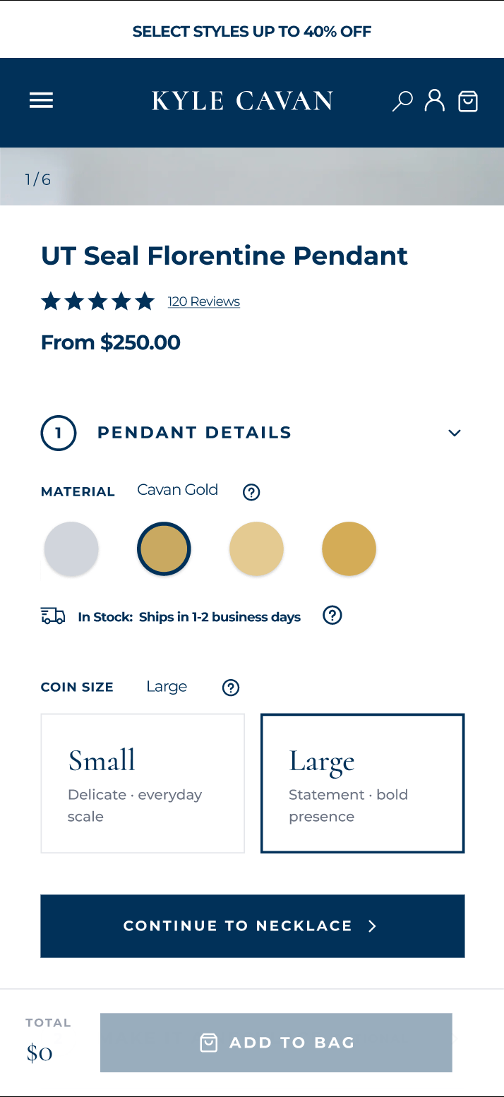
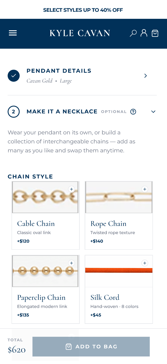
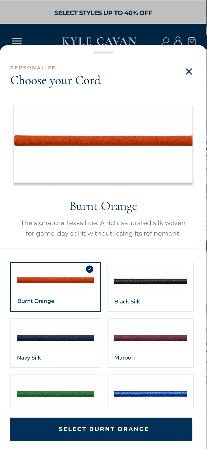
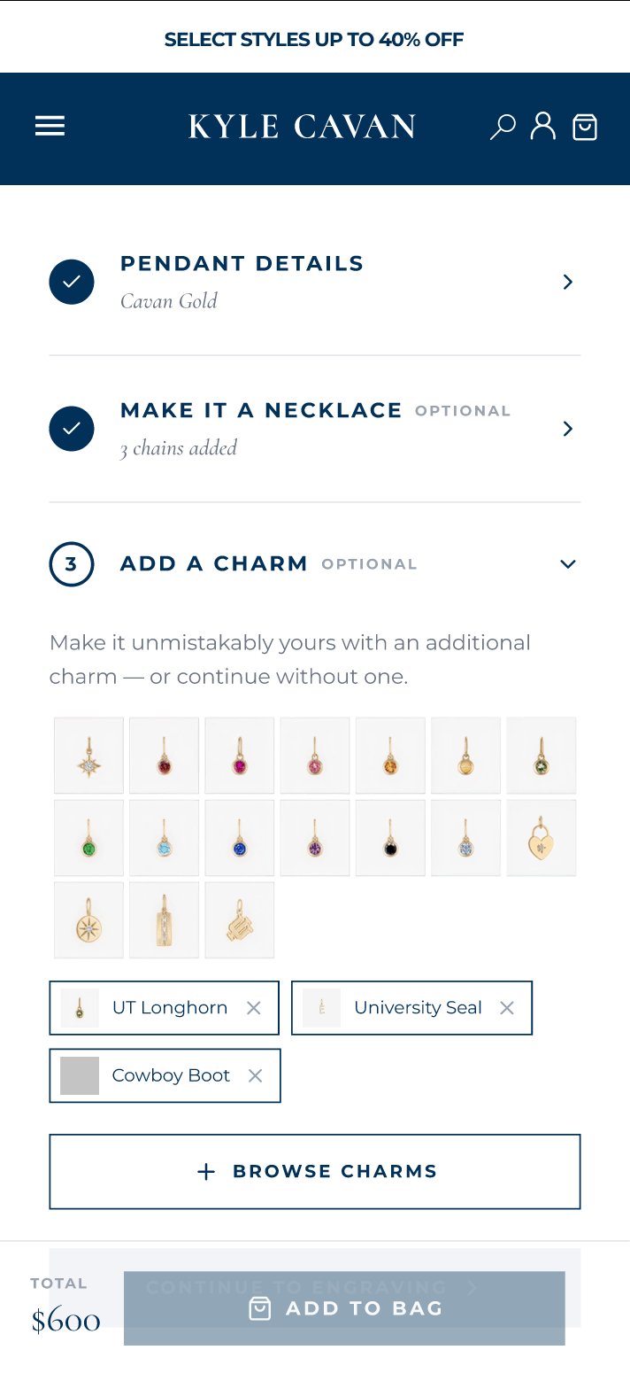
- 03Product pageStep-by-step customisation
- 04Cart & checkoutFewer drop-offs to purchase
The strategy
How weworked
Rather than working from a fixed, closed proposal, part of the project involved defining the scope and priorities as we progressed.
- 01
Learn before changing
We were working with a live website used by real customers. Before redesigning anything, we needed to understand what was already working and what wasn't, with weekly meetings and clear deadlines to keep the project moving.
- 02
Stay in sync
We kept communication open throughout the week via Slack, sharing progress and preparing suggested changes for the next meeting. The client could review prototypes, give feedback, and help shape each iteration.
- 03
Prototype first
Complex UX and UI flows were fully prototyped in Figma before development, allowing us to validate interactions and refine the experience early in the process.
- 04
The product page
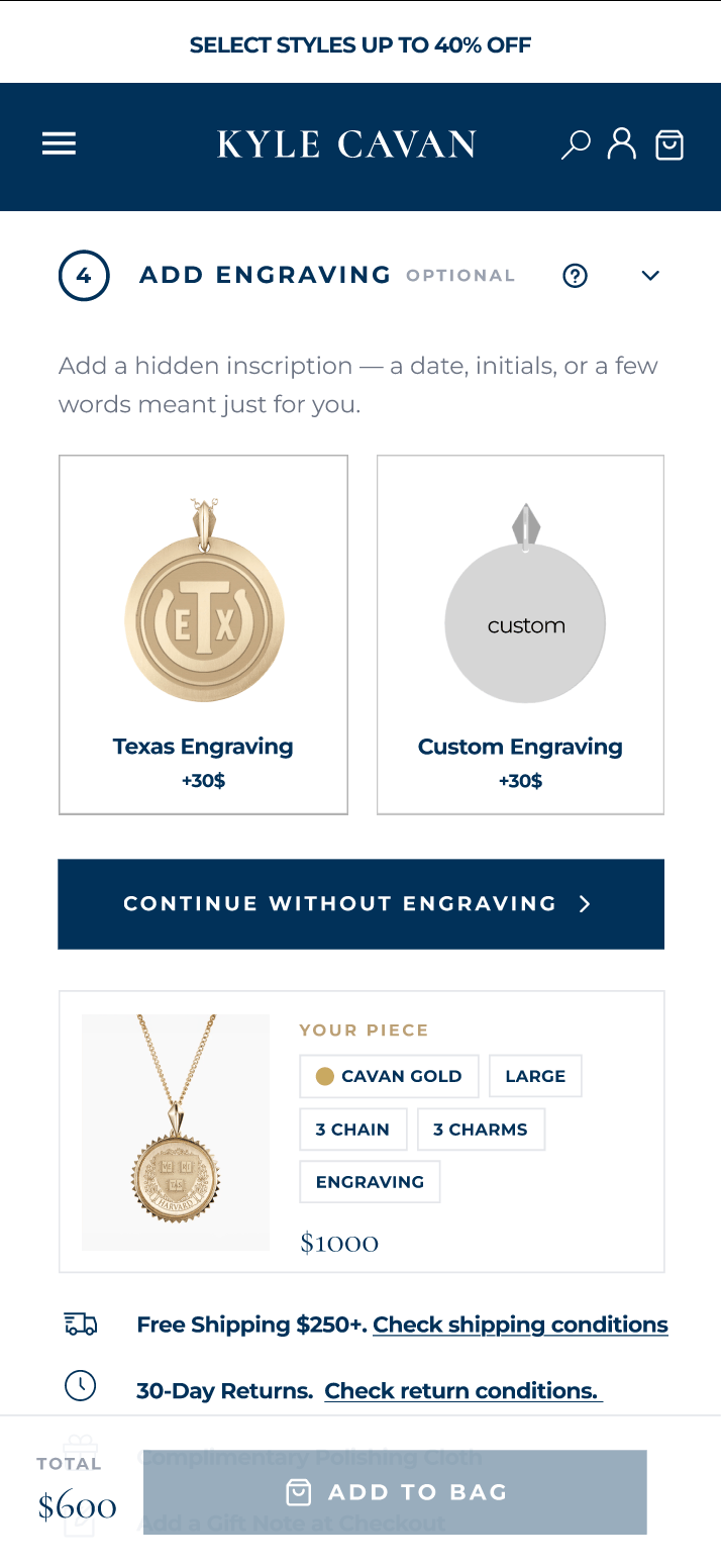
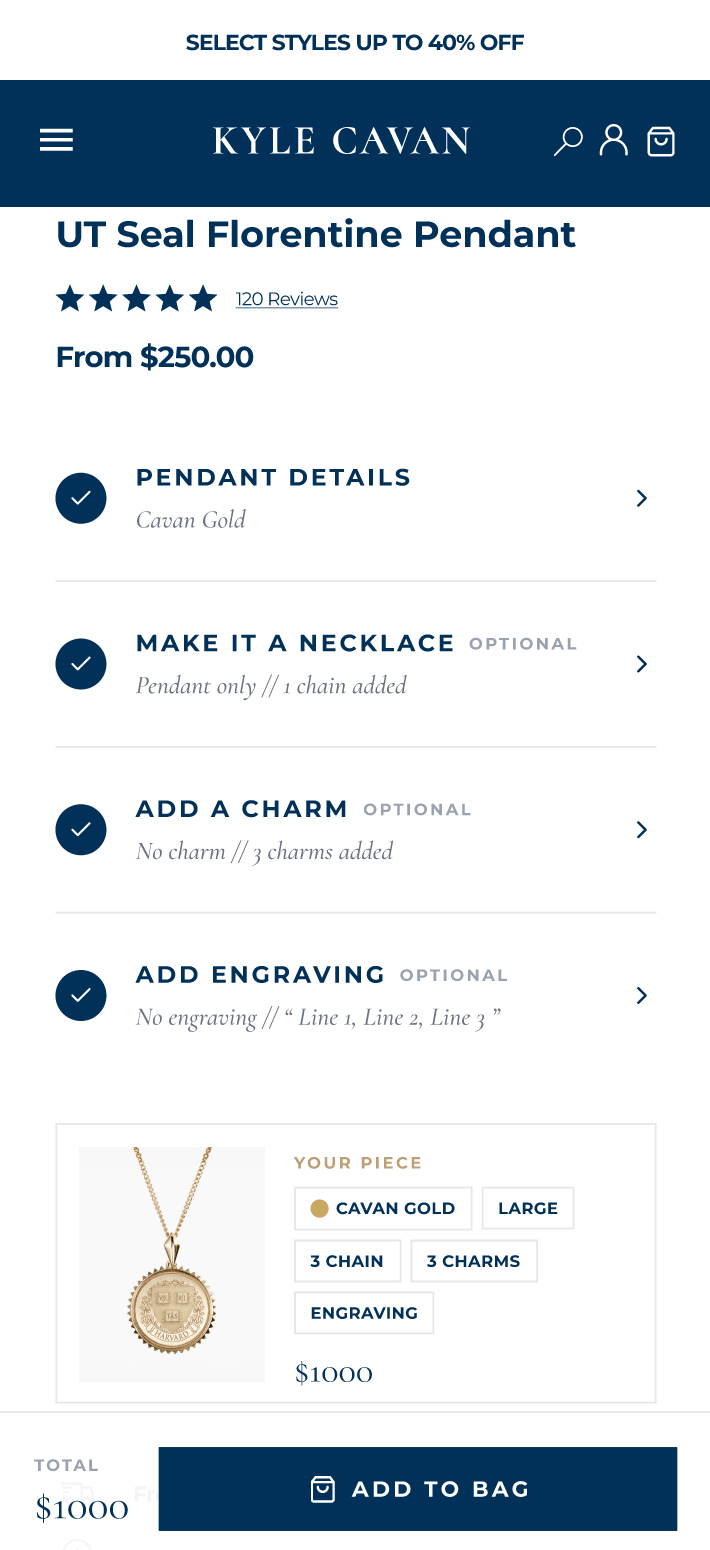
We prioritised the product page, where high bounce rates and complex jewellery customisation made the buying journey harder. We simplified personalisation while improving the page's visual design on both mobile and desktop.
- 05
Refine the collection experience
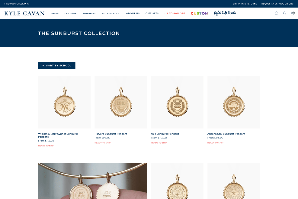
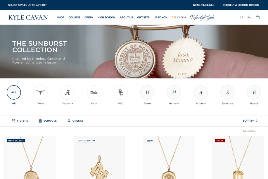
Once the product page was underway, we redesigned the collection pages and improved the filters to make browsing clearer and more efficient on both mobile and desktop.
- 06
A template for future collections
We designed a collection page template with customisation in mind. The team can rearrange content blocks and adjust elements such as titles and header layouts, choosing how each collection is presented while working within a considered design framework.
- 07
Bring the designs to life
After reviewing and refining the designs in Figma, we brought them to life through implementation. The full process was completed within two months, and the new experience is now live and fully operational.
- 08
An additional navigation design
As the team was pleased with the work, they asked us to take on an additional task: redesigning the navigation to make it more effective. This work was outside the original scope. The new design is complete, and implementation is still to come.
The results
Measurable liftin the first weeks live.
- Total sales
- +52%
- against the same dates a year earlier.
- Added to cart
- +47%
- more shoppers commit once the product page guides them.
- Conversion rate
- +7%
- every hundred visits now ends in more purchases.
- Sales reversals
- −38%
- fewer refunds and returns: shoppers get what they configured.
Shopify Analytics for kylecavan.com, end of summer 2026, compared with the same dates in 2025. Relative figures only.
- 01
Shoppers buy more per visit
Average order value up around 6%: chains, charms and engraving are easy to add, one step at a time, instead of buried in a wall of selectors.
- 02
Measured, not guessed
The whole project ran against a live store, so every change was checked against real customer behaviour before and after.
- 03
Built for the phone first
Mobile sessions up around 36%, and converting: the stepped journey was designed at phone width and adapted up to desktop.
- 04
Faster to the first thing you see
The product page's largest element paints around 45% sooner on desktop, while the overall Lighthouse score stayed consistent: a richer, guided page that added no weight.
- 05
Launch a collection without a developer
The modular template lets the team assemble a new collection page from pre-designed blocks, in Shopify, with no code.
- 06
Browsing that leads somewhere
School filters and a calmer grid take a visitor from a school to a product in two taps.
The project · Product page · Desktop
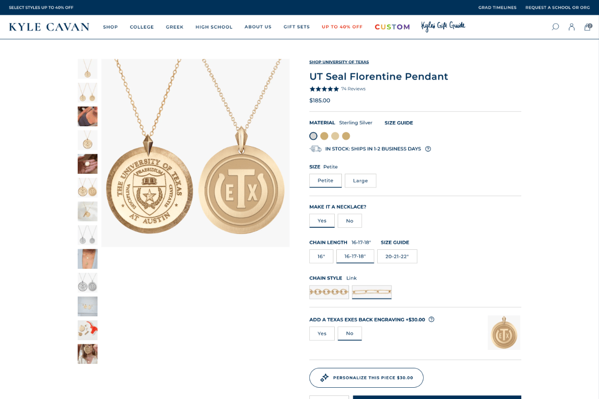
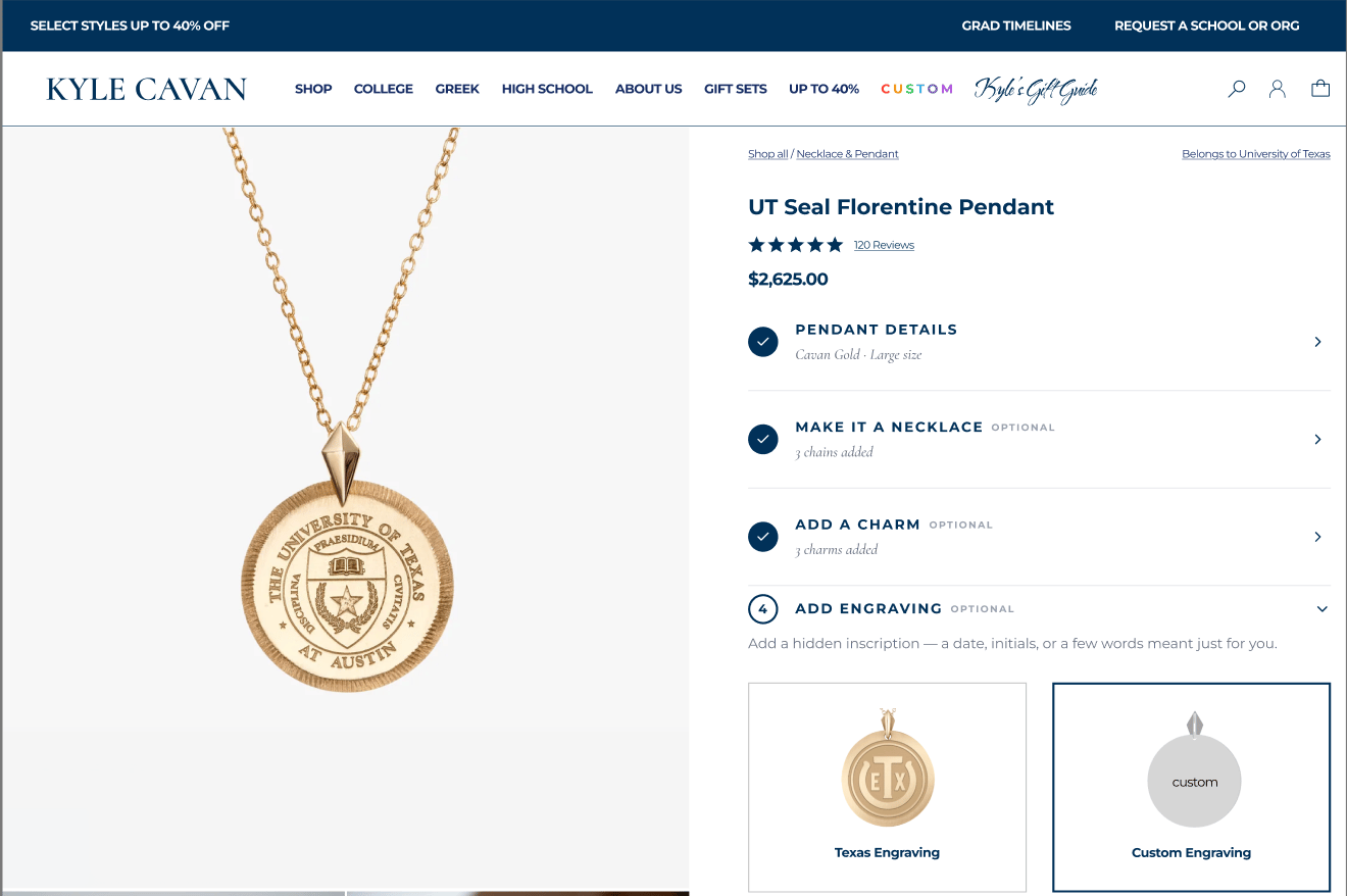
Product pagebefore & after
The same product, two eras. Drag the handle to reveal how a dense, option-heavy page became a calm, guided purchase flow.
- Before — live 2026
- After — redesign
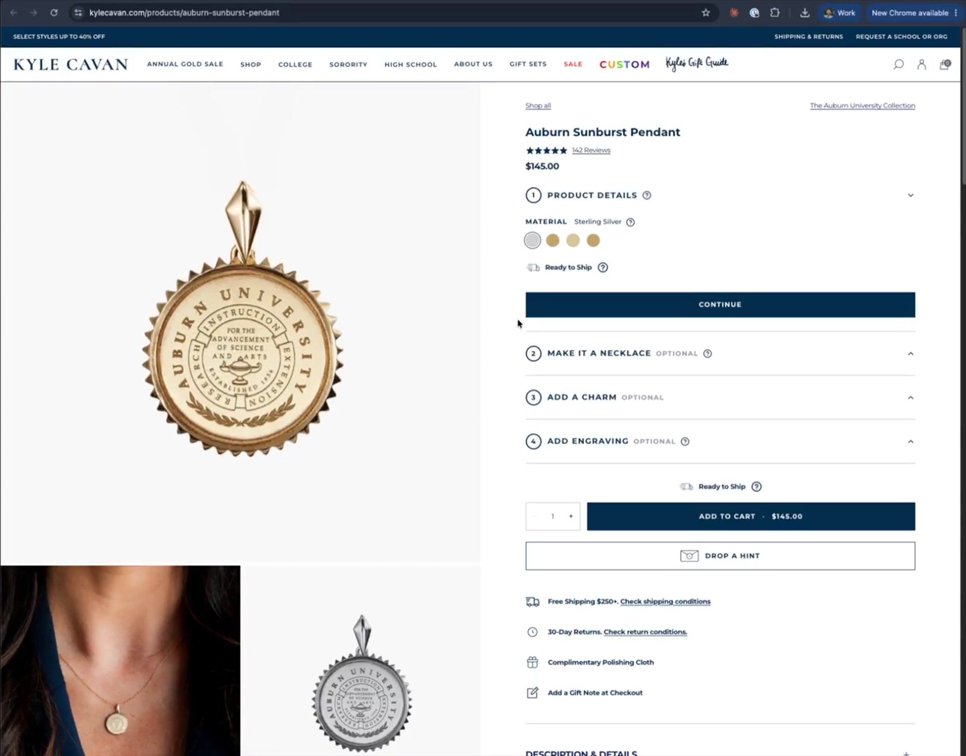
— Live version
See it in motion
The full process was completed within two months, and the new experience is now live and fully operational. Watch the desktop product-customisation flow, end to end.
The project · Step by step flow · Mobile
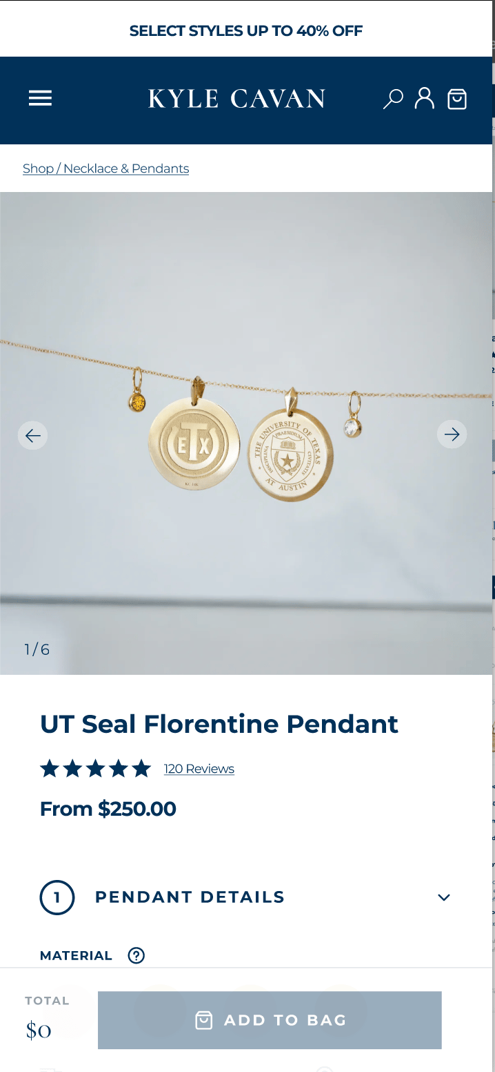
Mobile product journey
010701 of 07
Meet your pendant
A calm, focused product hero replaces the old cluttered gallery.
The project · Collection page · Desktop
Collection pagebefore & after
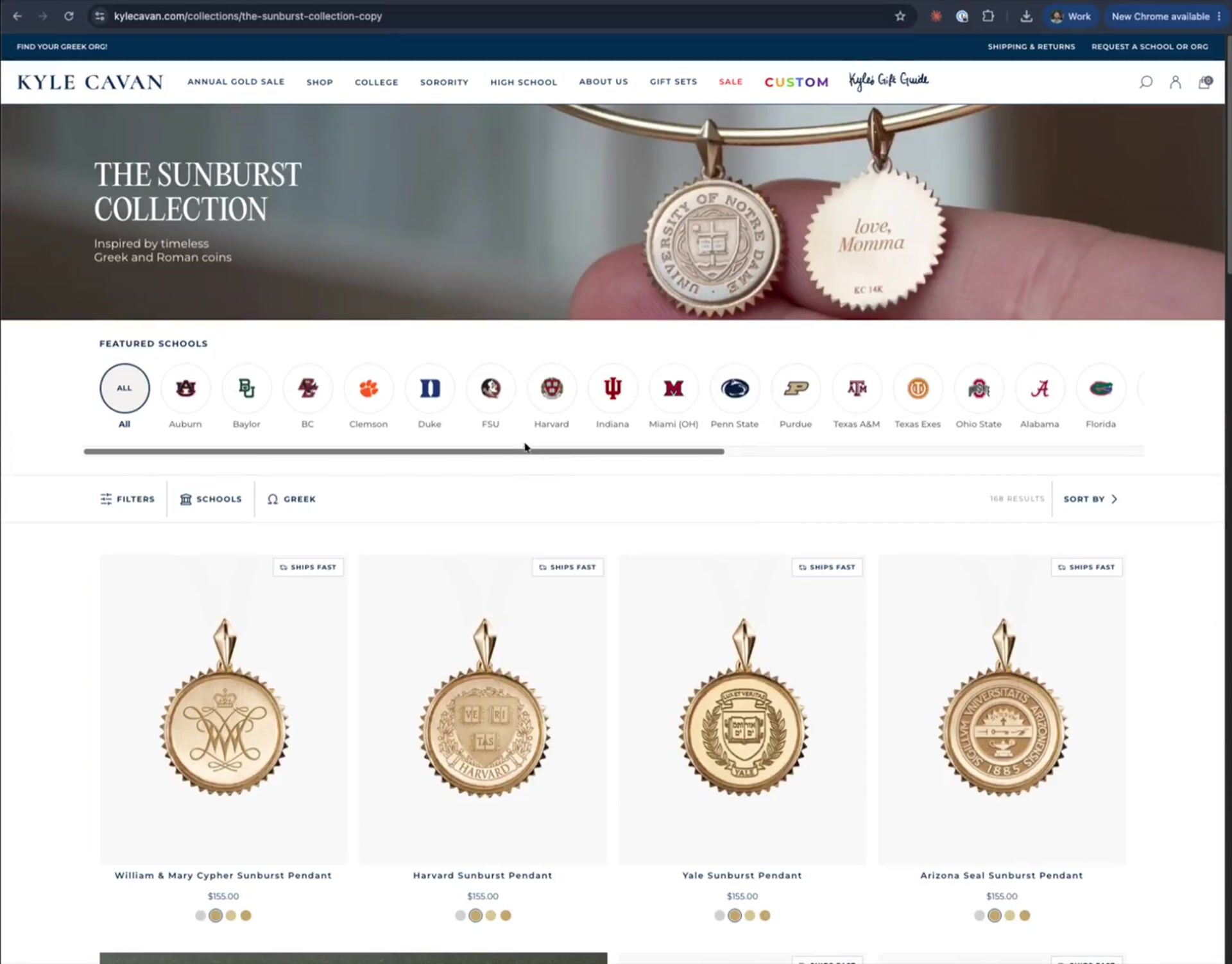
The same collection, two eras. Drag the handle to reveal how a crowded grid became a clearer, filterable browsing experience.
- Before — live 2026
- After — redesign
— Live version
See it in motion
Browse the redesigned collection experience the way customers do — clearer filters and a calmer grid, on the live site.
The project · New collection template · Desktop & mobile
New collectiontemplate
A flexible, modular framework for showcasing new collections — built and customised directly in Shopify from pre-designed modules, and consistent across every screen size.
Desktop

Mobile

Populated — The Architecture Collection

The same modules, filled with real imagery and copy — a launch-ready page assembled without touching code.
The conclusion
Studio Prats was a before and afterin our business

Caitlin Buchanan
E-commerce & Licensing Manager, Kyle Cavan
Client testimonial — extended quote
The discount codes, the attention to detail in everything — honestly, I can't thank you enough. Setting us up for success like this is invaluable. All the time we used to spend worrying about whether a code would be ready or not: we don't have to worry about that anymore. It just works. So that's great.